(Additional work samples available upon request)
HOW WE TALK ABOUT PEOPLe – PRESENTATION (Excerpts)
Early on at Zendesk, I noticed inconsistencies in how we referred to different types of people throughout the product, which could be confusing for customer service agents and admins moving from one page to another.

I collaborated with UX research and my product design partner to find out what terminology made sense to our users and conducted a competitor analysis to determine industry standards. Then I made recommendations that not only reflected how our users speak but also aligned with Zendesk’s voice and tone.
Most of my recommendations were implemented, making the product easier to understand and setting a standard for how we talk about people.


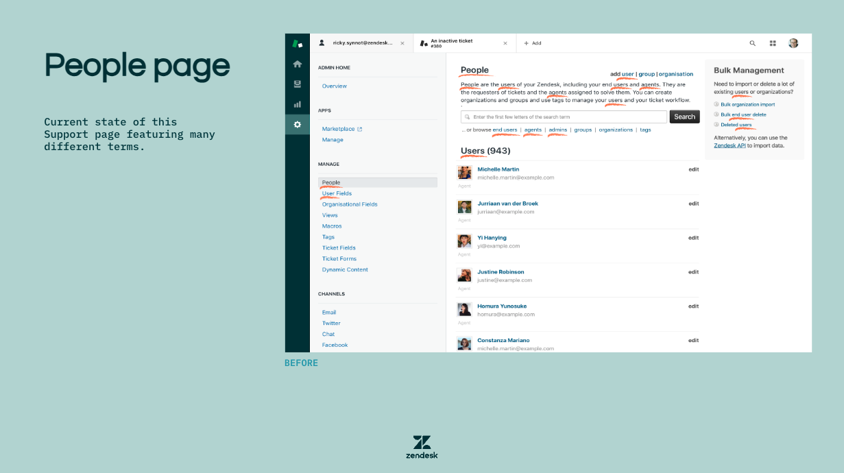
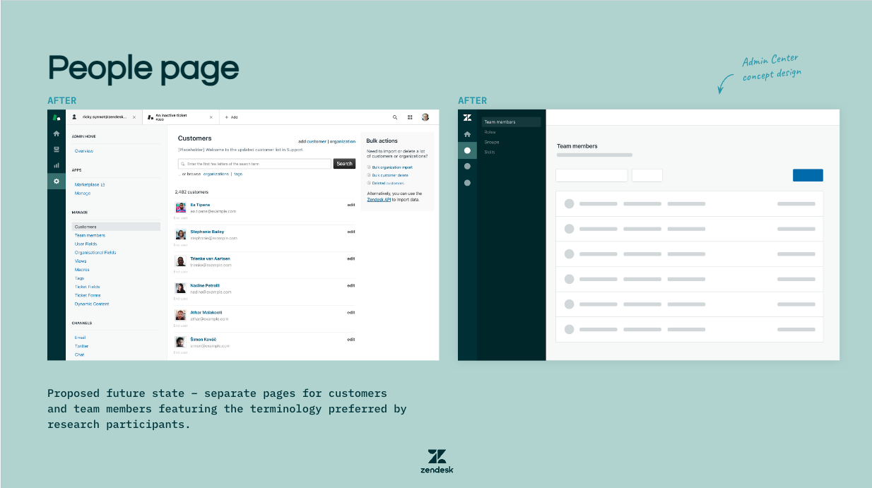
Following my recommendations, we created separate pages for different types of people –customers (aka end users) and team members (aka staff). Doing so makes sense because the jobs to be done are different for different groups of people. Users told us they had no need for a single page with all the people; in fact, it made their work more taxing because they had to filter out the people not relevant to their tasks. Not surprisingly, the new pages were well received by users.
BOT PERSONA SETTINGS
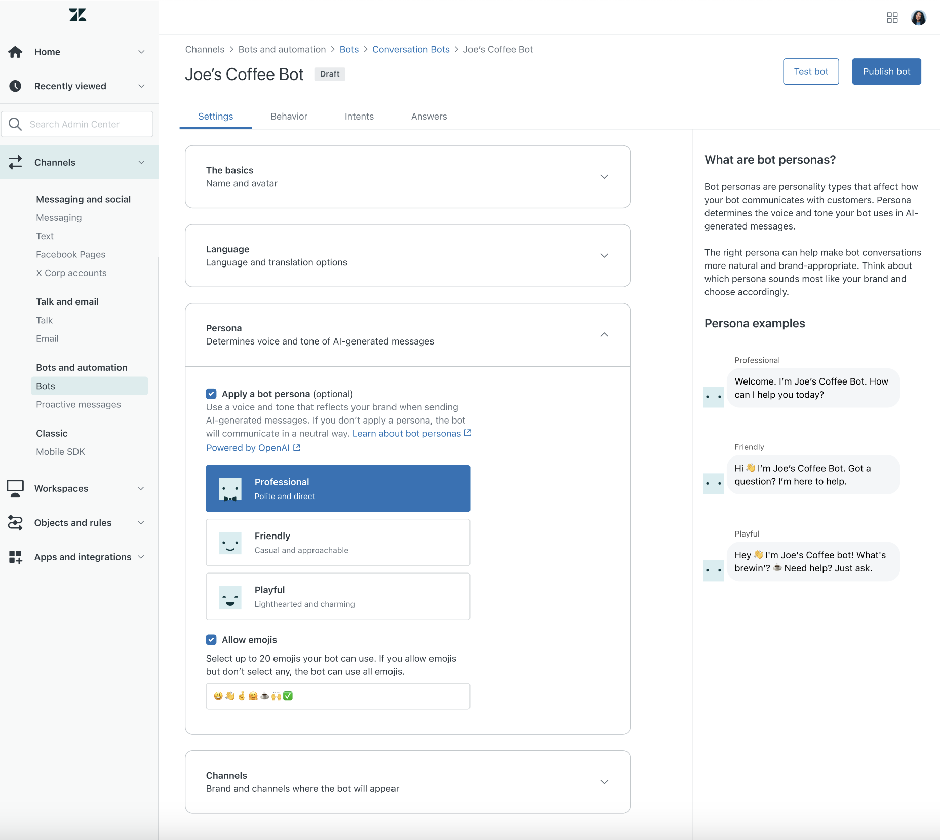
Bot persona is a new feature utilising AI to enhance the quality of support conversations. I crafted content to help admins understand the value and where persona would be applied. The sidebar content provides additional context to help them choose the best option for their brand. I also recommended the three persona names and wrote descriptions for each.
Since launching the EAP (early access program) in late 2023, a significant number of Zendesk customers have utilised bot personas. (The actual number is confidential).
BOT SETTINGS – GENERATe VARIATIONS
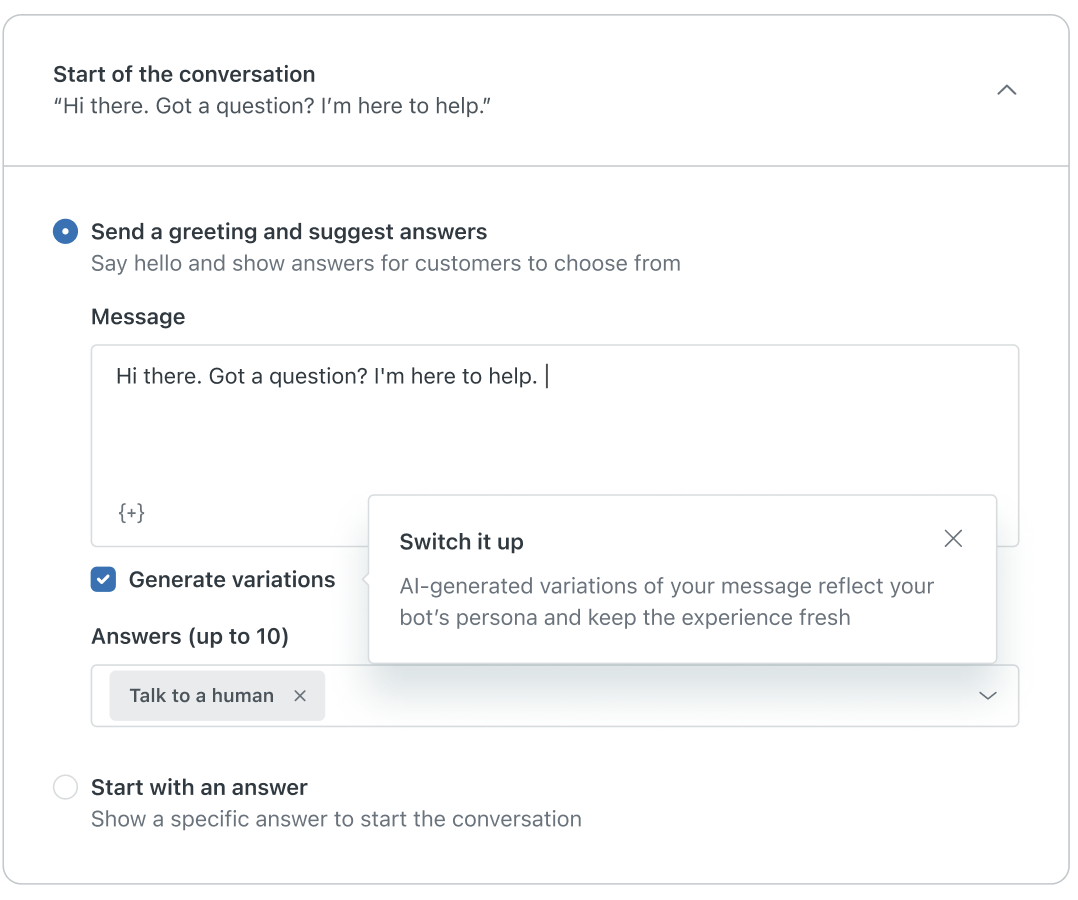
Once admins apply a bot persona, they have the option to show AI-generated variations of bot messages during support conversations. Since this is a new setting on an existing page we chose to highlight it and tout the benefits using a dismissible onboarding tooltip. The content explains that it’s AI-powered for transparency and to help build trust in this new technology.
bot settings – Generative replies onboarding

Zendesk recently introduced generative replies, an automation feature that uses OpenAI to respond to customer questions based on help center content. This is a new addition to an existing bots settings page, so we used a dismissible onboarding tooltip to call it out and highlight key benefits.
We know based on admin research that bot setup is often considered laborious, so focusing on simplifying setup made sense. The heading speaks to improving deflection – keeping support requests from being escalated to live agents, that is – so it’s likely to resonate and increase adoption. (No available adoption metrics to share at this stage; it’s still EAP.)
I also wrote the rest of the content in this section, clearly explaining the differences between the three options so admins can choose wisely.
Sandbox deployment
When I joined the sandbox team at Zendesk, a deployment feature had just been released as a beta. Admins who trialed it they told us they were confused when they got to the “Match dependencies” step. (See “Before” version directly below.) Looking at the table on this page, they weren’t clear about what they needed to do next – they skipped right over the instructional copy – so they couldn’t proceed with deploying from sandbox to production.
”Before” version:
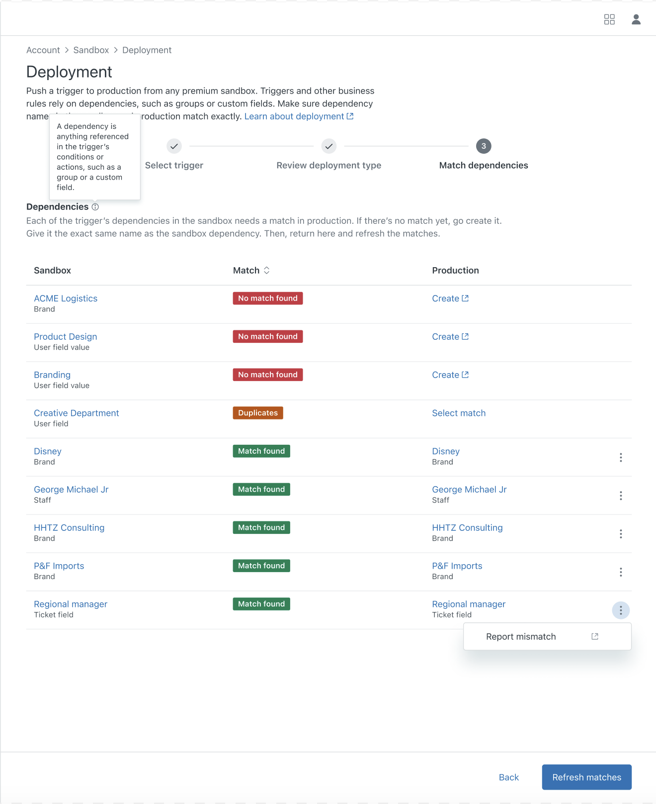
The product designer and I got together to discuss and sketch potential solutions, and I suggested we make the page more like a to-do list with clear calls to action (presented as buttons, not links) so admins would know how to proceed.
I also recommended splitting the different issues out into two distinct sections (one for missing dependencies, one for duplicates) with action-led headers and clear instructions for each to guide the user in resolving the issues. The alert well near the top draws attention when they reach this step, succinctly explaining what’s wrong and how to fix it.
”After” version:

The sandbox team agreed that this was a substantial improvement, and it’s what we released for the deployment GA. Since then, admins have successfully been deploying triggers and automations to production with ease and confidence.
Data and storage usage dashboard
Zendesk admins had been requesting more transparency around their account data and file storage usage so they could monitor and manage it. In response we created this usage summary on the admin homepage, which led to a more detailed usage page via the “View details” link.
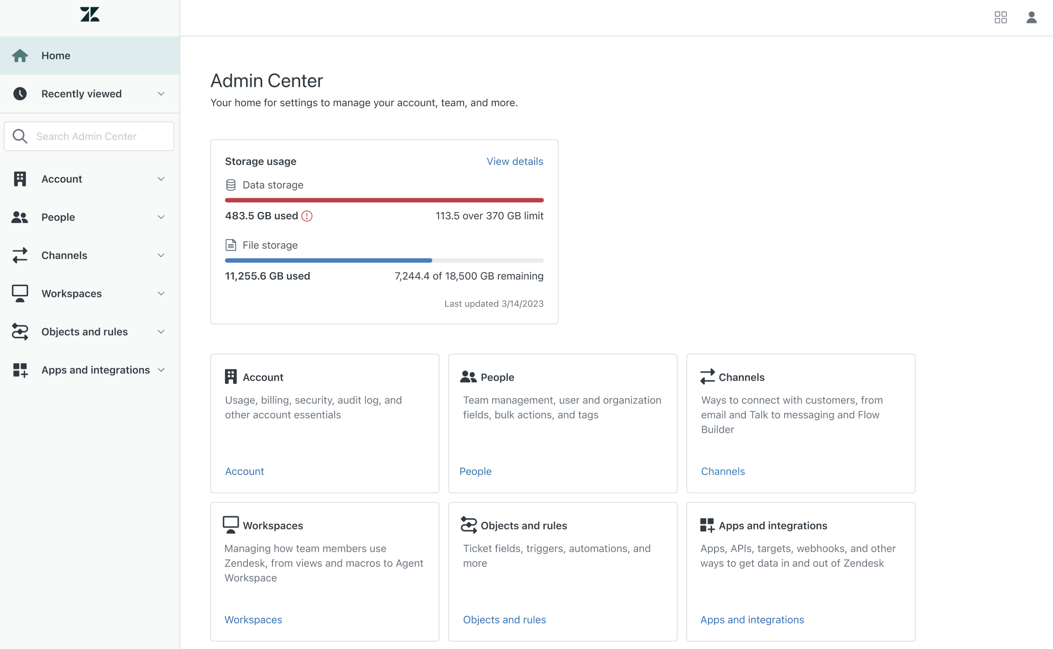
The coloured progress bars and associated data on the summary show, at a glance, how an account is tracking against the limit.
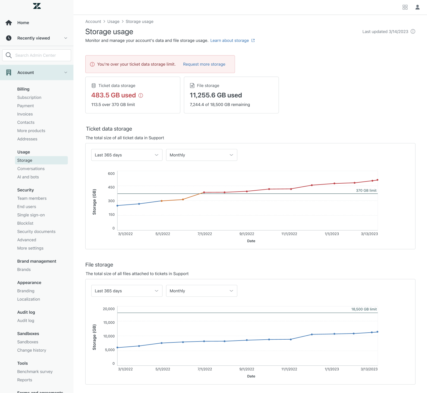
On the usage page we included eye-catching alerts with clear explanations when an account was near, at, or over the limit, as well as a call to action to request more storage. More detailed charts with usage details displayed on hover provide date-specific storage data.
These designs set the standard for other Zendesk usage pages that have since been developed, giving admins a consistent, familiar experience. In addition to showing admins the usage info they’d been asking for, these pages have led to increased revenue from the purchase of additional storage. (Revenue figures are confidential.)
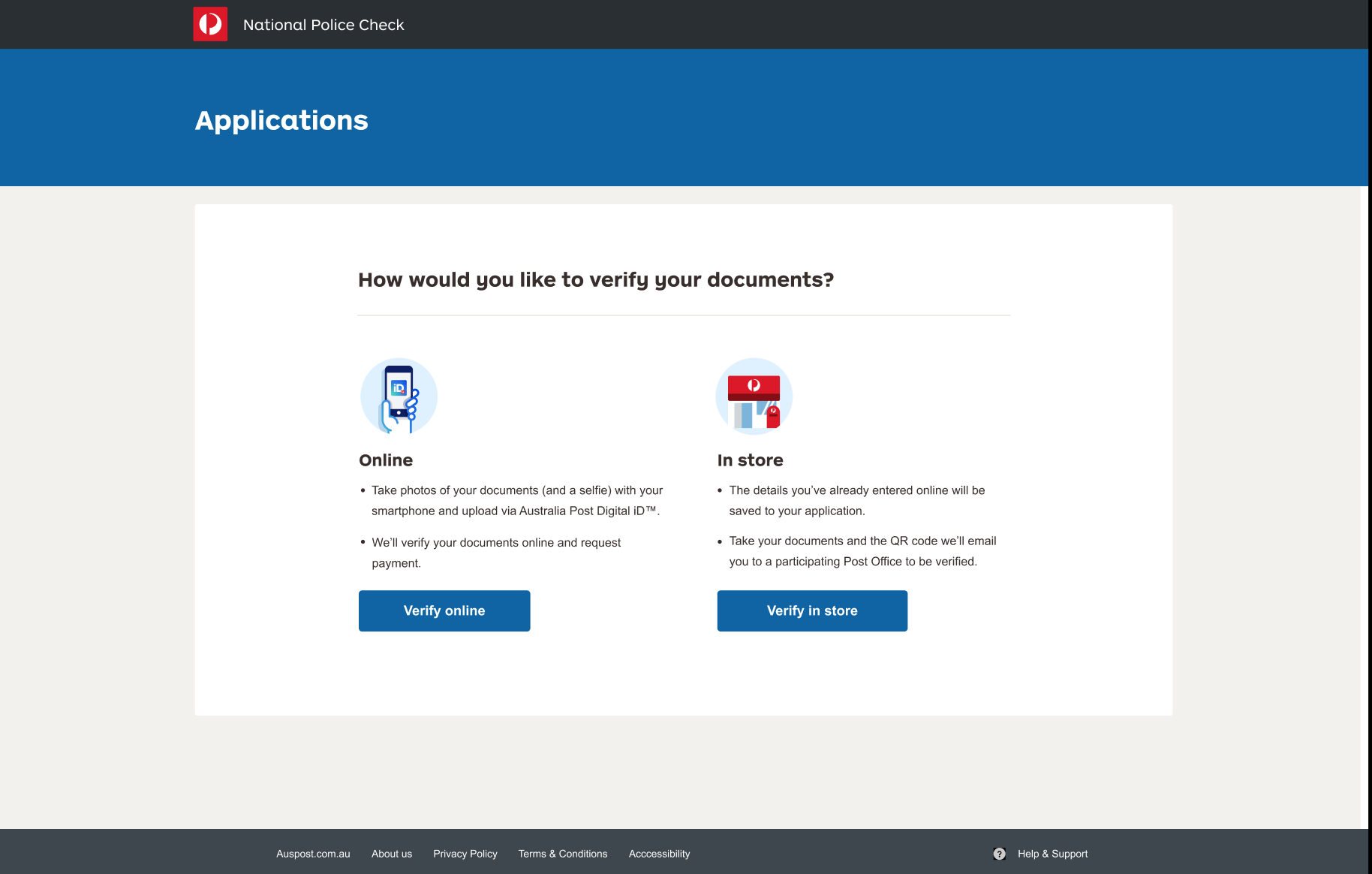
National Police Checks: alert message

Australia Post allows users to apply for police checks online or in store, but some ID documents require in-store verification. Originally, users who selected one or more of these documents couldn’t finish their application online but weren’t informed of that here. As a result, online completion rates were low, and many users dropped out altogether when later informed that they’d need to finish in store.
I crafted the copy for the alert message above to clarify the consequences of choosing one of these ID types and empower users to choose between proceeding and completing their application in store or selecting a different document type and finishing online.
National Police Checks: verify ID (after)
Once users enter their personal and document details on their police check application they’re given a choice between finishing online (assuming they have the right ID documents) or in store. Prior to the new design and copy shown above, many users were simply closing their browser windows at this stage, presumably thinking that if they wanted to finish in store they’d have to start their application over at the Post Office. Others may have been confused about the online verification process. (See ‘Before’ version below.)
We revamped design and copy to help users understand each option better, explaining that the details they’d already entered would be saved to their application if they opted to verify in store.
Police checks: verify ID (before)

Digital iD mobile app

As a product content writer for Australia Post’s award-winning Digital iD app, I created a wide range of copy: onboarding, instructional, error messages, CTAs, FAQs, marketing, and more to help users understand Digital iD’s value and how to use it.
Since launching in 2017, this ID verification product has gained traction and utility, and was accredited as a trusted service for verifying ID to access government services.

Instructional copy
My intent for instructional copy is always to be as clear and succinct as possible, especially for mobile apps like Digital iD.

Marketing copy
Digital identity verification was a relatively new concept for most users at the time, so explaining the product and benefit simply was essential in marketing messaging.
Marketing to businesses
Security is top of mind for consumers and businesses considering using Digital iD. We needed to assure potential partners that sensitive personal data will always be securely handled.
Based on user insights, we also adopted a no-nonsense, serious copy tone that instills a sense of trust.
MyPost One Reg
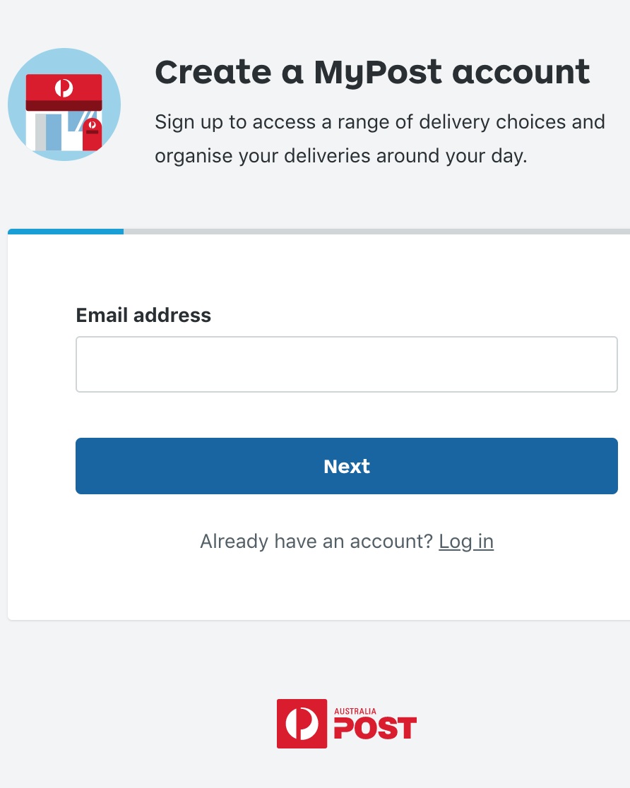
Previously, the signup process for Australia Post’s MyPost service was laborious and cumbersome. There were several form fields on an intimidating single screen, and users who’d forgotten they already had an account weren’t informed until after they’d entered all their details again – not a great user experience.
With One Reg, we created a simpler, more seamless experience with an updated look and feel. Input fields were limited to one per screen and friendlier, benefit-oriented copy guided the user along.
Not surprisingly, conversion nearly doubled within the first week – from 33% to 64% – overshooting the original target of 53%.

Those who’d forgotten they already had accounts were now reminded after entering only their email address.
We designed this experience so it could easily be used and adapted as needed across other Australia Post products and services, minimising internal effort and ensuring a seamless user experience.
NIKE.COM SIZE CHARTS


A large share of Nike.com customer returns are related to issues around size and fit. Legacy size guides on the site were difficult to use and even contained inaccurate information in some cases.
To improve the customer experience and decrease costs related to processing returns, two colleagues and I spearheaded a project to revamp and improve Nike’s online size guides across all regions and categories globally. Instead of the original illustrations, we used photos of real people to show in greater, more realistic detail how to measure oneself. I wrote clearer, simpler instructions and created charts that made it easy to find the right size so customers could order with confidence.
NIKE.COM IA

A team of us in Global Digital Commerce collaborated to revamp navigation on Nike.com for improved wayfinding. We defined product categories and their respective labels using categorization and localized language that made sense to users in various regions – no marketing-speak allowed.
NIKE.COM PRODUCT NAMING CONVENTIONS

While at Nike I developed naming formulas and conventions that could be applied across all products globally on Nike.com for consistency and clarity.
Previously, product names were limited to style names ascribed by the brand, giving online shoppers no secondary information about product type, or which sport or gender they were for. Variations in fabric and footwear technologies, jersey type, special sizes, team names, and other factors added exponential complexity to product names.
Despite the challenges, I developed a standard naming formula (it’s still in use) and got buy-in across the business to implement it globally. I also managed two contract writers tasked with updating thousands of product description pages using the new standards. As a result, users can find what they want faster, whether they’re searching for Nike products on Google (thanks, SEO) or shopping on Nike.com.